Friday, May 31, 2013

3D Typography Progress/Crit 2 - Meade

So I started to fill in the lettering Thursday morning

(not compact enough, but we're just testing out how it would go)


(brother helping out)


I didn't take a picture of the finished product upon completion, but in the afternoon, I went ahead and took the final photos in the intentioned setting.


I can't tell which one I like best.

And because I want to rub more photos in your faces, I took closer shots of the letting in the setting.


So which should I print?


Chinbayar Davaatseren, (3D Type) 1st Critique


I had two ideas, that I wanted to do but I decided to try them out both
I guess first one is kind of self explanatory
Second one is a Lamp Cover.


Tuesday, May 28, 2013

Harris - Critique 1


Watson 3D


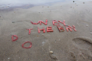
All I have so far is a concept. I'm still not sure how to go about using 3D yet. But what I want to do is try to illustrate how we give words meaning based on context and usage, and without them they mean nothing. I would like to create words that mean nothing and give them meaning through context. I have made an example image to exemplify my point.


Monday, May 27, 2013

3D type-jaramillo


For my project I decided to go for a different approach.I still want to do something with pictures and cupcakes but I want to use the quote "Life is Sweet". Im going to spell out the word LIFE and make it out of cupcakes. Im going to work with colors and also size to make it stand out and fun. For my artist statement im just going to write about life and how no matter how hard it can be at the end of the day life is sweet!


3d type 1st critique Mikula

I started my 3d type project about a month ago to allow time for my flowers to grow and hopefully bloom. For my project I built a rectangular wooden box and filled it with soil. Then I stuck popsicle sticks in and spelled out the word grow. I had no emotional connection or idea how this project applied to me at first, the idea of plants in type just popped into my head and I ran with it. If I had to make an artist statement about this project in relation to myself as an artist I would say that my career path could very easily be compared to  seeds growing into flowers (and yea this may be a little cheesy and cliche, but just go with it). I decided I wanted to be a graphic designer my sophomore year of college and this being only my junior year, I'm still a young designer and have a lot of growing to do. But just as there are guidlelines (the popsicle sticks) for the flowers to grow along, I have the support and help of my school, my family, my friends, and many other resources helping me grow as a designer (and it can be bigger than just as a designer, just myself in general). So that is the meaning I've found within this project and I'm loving the progress so far!


These pictures are not cropped and color corrected yet but this is the idea.