Monday, April 29, 2013
Thursday, April 25, 2013
Textbook Remix Crit 2 - Meade
So I fixed the triangles that needed a tweak in their placement, make the 'Take it Home' triangle an equilateral to match the rest, darkened the yellow a bit to make it more of a gold and resized the font on a few sections as advised during the last critique.
As for adding texture, I won't try that until after all the spread have been finished and see if I'd like to incorporate some. As for shaping the photos in a triangle way, I tried and it still looked very odd and then if it didn't look odd, it was a pain to try and fit them neatly on the page without them then looking too over crowded with triangles.
I'm very insisten on using black. That may or may not bite me in the ass later, but for now it's staying.
Dorian Sosa_Book critique 1
My concept is based on simplicity. My eyes hurt looking at the usual textbook designs, I have always found their format unnecessarily cluttered and unorganized. In an attempt to make them interesting they tend to end up making it harder to focus on anything since the pages are so saturated with pictures and 300 different fonts.
For my design I will rely on simple images, combining them with type to make them visually appealing, while keeping the pages clean so the students can focus on the content.
The three first spreads are three different concepts for the same spread (the Unit cover and the Index page). The basic idea in all of the three different covers is representing the three stages of matter (liquid, solid, and gas) through the combination of type and image. (the images still need work in photoshop, this is just a mock up of what I will combine)
The last spread is the concept for the Lesson opener and the Lesson Lab
Textbook crit.1- mjaramillo
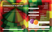
THis is my first draft of the first two spread of the textbook. For the first two pages, I feel like they are good but Im having trouble with the second spread. I feel like alot is going on but I wanted to keep the theme and colors. If anyone has any suggestions feel free to let me know.
Wednesday, April 24, 2013
Tuesday, April 23, 2013
Textbook Remix First Crit - Meade
I wanted to stray massively away from the skeuomorphic style that Reid and his team did for the book, so I went more minimalist, modern and with lots fo colorful shapes to play with the viewer.
I've designed the textbook with two big things in mind: More space for the kids to write their answers in after the questions (because god knows we always needed more space for that shit and got frustrated that there never was when we were at that age) and to have more open/white space for the kids to doodle and write. As a kid who always drew and wrote in her textbooks in middle school and high school, I valued books that had more space for my doodles than books that have a random ball or superfluous picture taking up 'precious doodle space'.
I still need to add in the pictures. In these two spreads there will be a picture in the upper right hand corner of page 3 and on the bottom half of page 4.
Subscribe to:
Posts (Atom)


